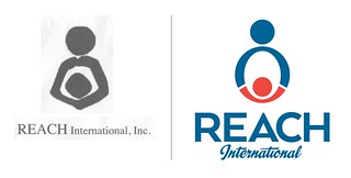
 REACH International, a 40-year-old charity based in the Washington, DC area that sponsors children in developing countries, asked us to redesign its logo and create a new fundraising brochure. The organization is small but has global reach, and its existing identity was dated and looked rough and unprofessional.
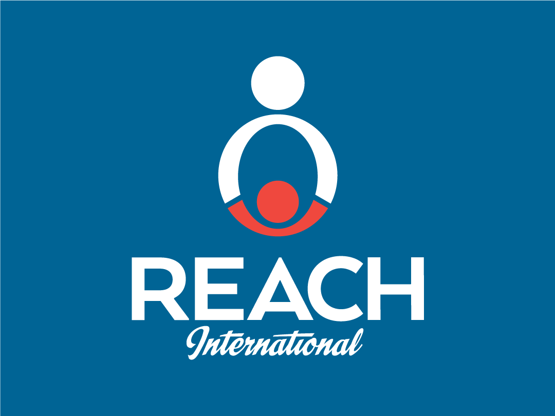
Starting from the existing concept—a child embraced in an adult’s arms—we explored various geometric shapes that could be used for the “arms.” We eventually settled on an oval as the simplest and most evocative. Making it taller than the original logo made it less of an embrace and more like the child is reaching up, like they’re holding hands. Adding the breaks to the oval made the adult-child relationship more explicit and allowed for differentiation by color. Modern, lively typography and bright colors completed the transformation. As always, we then built it out in various orientations and formats.
 Executive director Cheryl Jacob-Roeske said, “The logo is stunning. Initial reaction across the board was WOW! We love the clean feel of it, and the little red child with the reaching arms is really perfect for what we do. It puts the focus on the child, which is where it should be. I am already feeling very cool being associated with our REACH brand!”
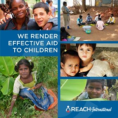
For the brochure, REACH wanted something that would resonate beyond the charity’s traditional, religious base and appeal to younger, more secular donors. We worked with Deborah Brody of Deborah Brody Marketing Communications, who crafted key messages and descriptions that could be used throughout the organization, as well as brochure copy that encouraged donations and sponsorship. Lively photos and the organization’s new, brighter color palette reinforced the change. See the full brochure here.
