Branding
Client: 230 Water Resources Group
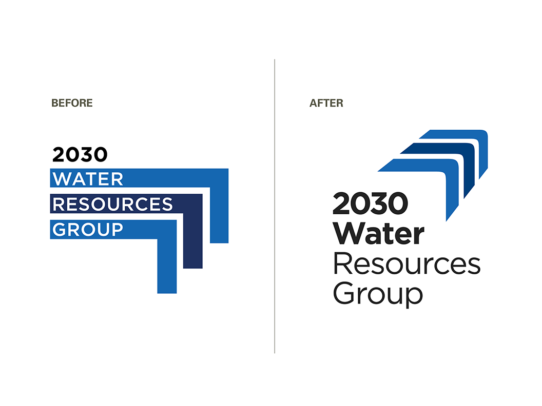
In branding work, sometimes small changes can make a big difference. We were asked to redesign the logo for 2030 Water Resources Group (2030 WRG), a public-private-civil society partnership that works internationally on water supply and access issues. They had an existing logo (left) that didn’t suggest water, and was not easy to work with. We were asked to design something more appropriate but that still referred back to the original in some way.
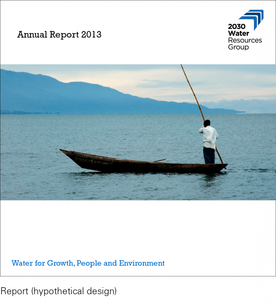
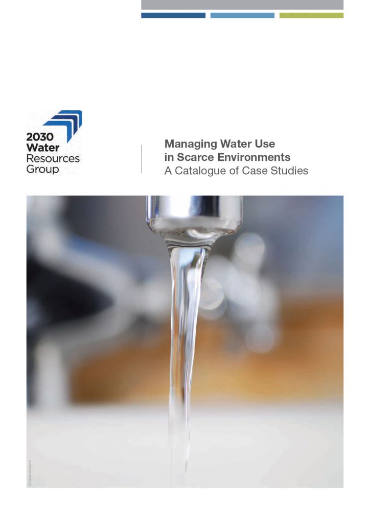
Our solution, as seen at right, was to separate the text from the color bars and change it to a more readable mixed case. We added a curve to the bars and perspective to the edges, and subtly adjusted widths and spacing for a three-dimensional effect. The resultant shape subtly evokes a waterfall, and can also be read as arrows pointing to the future. We retained the existing colors (with slight tweaking) and the original font, Gotham, to maintain continuity, but the final logo has more presence on the page, reads better at small sizes, and is more distinctive and appropriate.
Carmen del Rio Paracolls, 2030 WRG communications officer, said, “At 2030 WRG, we had an old logo that didn’t really represented us but that people have started to recognize. We decided we needed a new logo that wouldn’t mislead our audience but that would incorporate elements that will resonate with the issues we work with. When we were searching for a graphic design company, some colleagues recommended Sensical Design, and we weren’t disappointed. Sensical perfectly understood our needs and reflected them in a brand new and fresh logo that pleased both us and our audience.”
Scroll down for more images.


